Monday 26 March 2012

Eliza Jean 2nd Location Photoshot- 25th March

During this shoot I thought I would try out a kind of mythical look, the different textures of the trees and bushes I thought might offer something different to the pictures. However due to the land not being flat the camera kept on going out of focus and unfortually I didn't realise, also many of the images were took too far away as I was trying to get the location in. After I looked at these photos I decided these images weren't suitiable for my magazine and the look I was going for however they allowed me to see what my model would look like in different lights, and how should would cope with being on loaction.

Sunday 25 March 2012

Week 4- Diary Entry

This week I started setting out my magazine layout on indesign, due to me already designing how I wanted it to look, this was a very easy task. I chose to use layers when setting out the layout, this would make it easier for me later on in the project because I will be able to add and remove things without it effecting other items on different layers. The use of layers will also allow me to add pictures and text in throughout the project as I get them allowing my project to be developed over time.

Once I had set out my layout, I conducted some audience research to find out about my target audience and what they want out of a music magazine. This gave me some very interesting feedback which I can use in my magazine to make it attract the target audience.

This week I have also planned my images that I will be taking for my magazine, I have decided on a mix of location and studio shots. I want to go for a mixture of males and females. I also want a few live shots and due to me going to Florence and The Machine next week I am hoping to get a few good ones there of Florence and her support acts- Spector and The Horrors. This will add a great mixture to my magazine, it will also make it interesting for any fans of these three bands because there getting a insight of their live gigs. I also want my location and studio shots to have a fun, quirky vibe to them.

Friday 23 March 2012

Rough cut feedback from target audience

Things target audience currently like:
  • Colour Scheme
  • Front Cover is busy
  • Magazine Title 
  • Layout
  • Good images 
Things target audience felt needed improving:
  • Model doesnt fit genre
  • Yellow colour- possiably use white instead
  • Model doesnt engage with audience
  • Wider use of fonts
  • Tilt the picture of Florence and the Machine
  • Barcode too long+ too many numbers
  • Colour of Writing at bottom of page hard to read.
                                                       Things target audince liked on my contents page:
  •  Busy contents page- lots to talk about
  • Good stories on contents page
  • Layout
  • Range of photos
  • Variety of photos  
  • Range of models
  • Good photos
  • Main model wearing same colours as text
Things target audience felt needed improving on contents page:
  • Captions on photos
  • Page numbers
  • Change the background colour from white
  • More interesting fonts
  • Typing error

                                                                           Things target audience liked on my Double page spread
  • Layout of Article
  • Good Article
  • Font sizes- break up the text
Things target audince felt needed improving on my double page spread
  • Range of fonts
  • Range of colours- seems very plain
  • More interesting fonts
  • Model doesnt engage with audince
  • Page numbers            
  •  More drop Capitals

Rough Cut

Once completing my rough cut I was disapointed with it and felt their was many things that needed to be improved. After completing audience research this was confirmed with many people thinking my model didnt connect and my colour scheme wasn't right therefore these will be two things I will defentially change. I was also disapointed with my contents page and the layout therefor I am going to work on this straight away as I feel it looks very unprofessional and unfinished.
 

Thursday 22 March 2012

Audience Research Video- Rough Cut

This is some audience research I completed about my rought cut front page, I wanted to find out about what my audience liked and disliked about my magazine and what they felt needed improving for the final cut.

Monday 19 March 2012

Double page spread analysis

This double page spread from Q magazine contains three columms full of text this gives the information, but it doesn't look like there is too much writing, therefore people are encouraged to read it.l
The story also uses a block capital for the begining of the text, this is a typical convention used in many different double page spreads, the font used looks very femine and goes with the other text and the image she is trying to portray.
The colours used for the backgrounds are grey , this allows the image of Florence Welch stand out from the page and attract the audiences attention. Her pose also looks very femine and powerful, the use of the red and white fabric reminds me of a flag, due to them connecting the text with the usa this is a good use. The image also acts as the background for the article connecting the two pages together. The use of her name in navy blue allows it to stand out and attract people to her name straight away, informing the audience of what/ who the article is about. The use of the colours red, blue and white are all the colours of the american flag. The one thing I dont like about this double page spread is you can't tell which magazine it comes from. It is a article from Q magazine but they don't make refrence to the magazine at all in the article.

This is a double page spread from Q magazine, this can be seen buy the colours used- traditional red colour also used for the Q logo and also from the tag line at the bottom of the page which includes the well known logo. The large drop capital at the behind the text draws you attention to the page straight away this is good, however I personally don't like this convention and won't be using it in my magazine, because I think it draws the attention away from the text. The image of Cheryl Cole is a very powerful image which makes you look twice because it isn't a photo that you would expect to see her in, often her photos are very sweet photos, however Q have challenged this and made her come accross as a very powerful solo artist who is ready to take the charts by a storm. The second smaller image links the two pages together because often to do this the largest image will overlap the two pages. These two images are quite dark and make the audience interested in what they are trying to show.

This double page spread comes from NME magazine, this challenges typical conventions due to them using four collums whereas most music magazines only use three. the use of a quote in the center of the text breaks it up so it is easier to read and gives a insight into the text and what it has to offer. The use of drop capitals invite the reader in and attract their attention to the start of different paragraphs. In this double page spread their are many different images used they all overlap and connect to each other and the article. The mixture of the black and the orange allow the parts in orange stand out while it still lightens up the black text. The images suggest that the artist is just a normal girl who has been very lucky and became successful through her love of music which can be shown by the use of real instruments used in the images. The layout of the images make you interested and allow your eyes be drawing over the page looking at all the images.

This is another double page spread from NME magazine once again this article challenges the conventions and uses four collums instead of the typical three used in competitor magazines. However the three collums are together but there is a image used to split these collums up so the text doesn't look to together and discourage the reader to read it. NME use a quote from the artist as a title, this give a insight into the article and makes the audience interested into what it is about.
The image used goes over two pages linking them together allowing people to read the whole of the article. This issue of NME is a Reading and Leeds special and throughout the issue they use the colours associated with the logo, Red, Yellow and Black, this keeps a continuous flow throughout the article and keeps reminding the audience of the special issue and of the festival, due to it being a special preview, therefore it is promoting the festival and what it has to offer.

This is another issue of NME covering a band named the Viva Brothers, throughout this article they play with this name giving them the use of the title VIVA IBIZA, the name has also gave them the idea for the image because they look like four normal lads who are on a boys holiday in Ibiza this allows the reader to feel like they are getting a insight into their lives and feel connected with them. In the middle of the text this breaks the text up and also gives a insight into the article. The use of yellow and orange as the main colours in this article attract your attention and make it seem summery, as soon as you look at the double page spread you insitently feel like your there with them. The use of block capitals invite the reader into the paragraph and makes them aware of the start of that paragraph. Again NME are challenging typical conventions by just using two collums for their text whereas normally three are used, this possiable gives a insight into the artists and the target audience.

Sunday 18 March 2012

Week 3 Diary Entry

This week we have work experience so all week I was not at school. However this week I decided on my final ideas for my music magazine. I decided I wanted to do a music magazine like "Q" magazine, this would be a kind of indie magazine, coming from a very british point of view. Therefore to get across this british approach I intend to use a three colour colour scheme of Blue, Red and White, the three main colours associated with britian. I also plan to call my magazine The Fix, a magazine hoping to give everyone the lastest music news and interviews.

This week I have also completed rough drawings of how I want my music magazine to look. This has allowed me to plan the page layout so I know how many pictures and stories I need. This allows me to plan time to get pictures and plan stories. The completion of my rough drawings allows me to be able to complete the layout once I go back to school, allowing me to just add in the images and text once they are complete. The layout is one of  the most important things because if a magazine looks empty, it looks unprofessional and unfinished whereas if it is cluttered it discourages customers buying it and makes it hard to read and spot things on the magazine. Therefore I will need to plan the layout out so that it attracts customers, doesnt look cluttered and allows things to stand out.

Saturday 17 March 2012

Contents page

 Q magazine contents page
Recognisable Q logo in corner of page, allows continuinty from front page through the magazine.
Simple colour scheme - Black, Red, White, Grey keeps it simple everything stands out and you can read everything. Four easy on the eye colours, not to bright so they hurt your eyes.
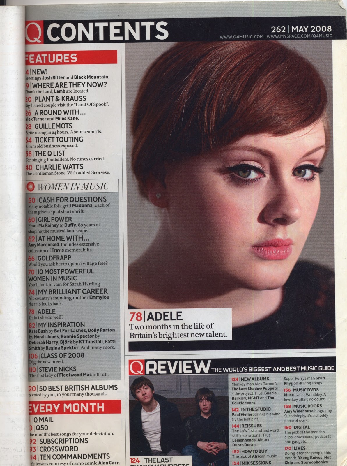
Adele the main story large close up attracts the audiences eye straight away allows you to notice she is the selling point of the magazine. She is looking directly at the audience making a connection with them. Simple hair and make up reflects her as a artist and what the magazine stands for. They offer music and that is all.
Organised layout, easy to find what you want, all the stories being down the left and reviews and pictures down the right.
The date and page number are located at the top right hand corner, easy to find, stand out on the black background. Typical convention inform the reader about when the issue is for.


 Mojo Contents Page
Simple colour scheme- Grey, White and Red simple colours all stand out from each other.
San-serif font it is easy to read, gives a informal approach which is perfect for a music magazine. The font is also large so important parts like the names e.g. Florence Welch stand out and you can read them from a distance.
You can tell straight away from looking at this page that the main story is going to be on Florence Welch, the picture used is of good quality, takes up half the page, she has a good confident stance which is also very interesting from the different shape she is creating, giving opportunity for the text to reflect this shape, making the page look very interesting and that it's been thought through and planned.
The black clothing with pearls make her stand out from the grey background, as soon as you look at this page the image jumps out at you. The pearls and velvet dress give texture to the image and express her personality and the type of music she creates. The image is very simple but effective and perfect for the target audience who aren't interested in huge performans they are just interested in the music and what artists have to offer.
The use of the date, page number in the bottom left and the issue number are all typical conventions of music magazines, they inform the audience of when the magazine was created for and also what page they are currently on so they can find the page they want easily.
The small descriptions underneath each story, give a small summary of what the story has to offer, this encourages the reader to read it and be interested.


Mojo Contents page
Quote from the interview "I checked myself into a New Orleans psch ward. I do not recommened it." makes the reader intested they want to read the rest of the interview to find out what happened and why he doesn't recommened it.
Mojo written in capital letters in sans-serif font, makes it easy to read stands out, continues on from front page keeps the continuitity.
All the titles of the stories are written in capital letters, convention which many music magazines use, this makes the name stand out and attracts the readers attention and you see a name you like and straight away you want to read the story just because you like the artist.
Pose of Trent Reznor, looks arrogant, the caption of the photos say he is looking back on his time, the pose links with this as he looks like he's thinking and looking back on everything he has done but he's waiting for the future to come.


Sunday 11 March 2012

Week 2 Diary

This week I started on the final task of making a music magazine before I started planning my magazine I needed to conduct some research into music magazines and the conventions these use. This allows me to realise what I need to do to create a professional looking music magazine. After deciding that I wanted to do a "Q" style music magazine I focused most of my research and analysis on "Q" magazine, but I also did some research on magazines such as NME so I could compare the conventions used and why they have been used in that certain magazine. After conducing my research I was able to come up and plan my initial ideas for my magazine, using my research I knew what had to go into the magazine and what I wanted it to look like, making my initial ideas easier.