Kate Murphy Media blog
Tuesday, 1 May 2012
Audience Research Video- Final Cut
Finding the right location for my images
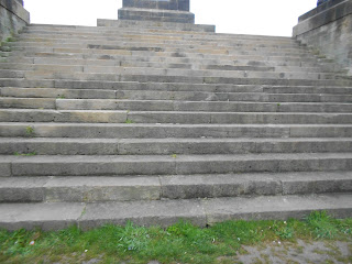
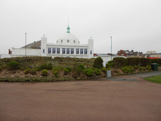
For one of my location shoots that I was doing with my model who was going to be Eliza Jean I decided I wanted to try and get the photos at a local small beach and sailing club this offered many different types of settings and props. The different colours also allow me to use a variation of them in which I can use them for different photos.
Another set of photos I wanted to get accross a fun approach, therefore I went to a local seaside town which give a touristy feeling. The different props and settings in a small amount of space.
While I was at the small beach and sailing club I found a few other places where we could get photos I thought we would try these but once I got the photos I decided I didn't like the location as I felt it looked quite boring and it didn't attract you eye with the bland colours.

Monday, 30 April 2012
Michael and the Misfits 2nd shoot
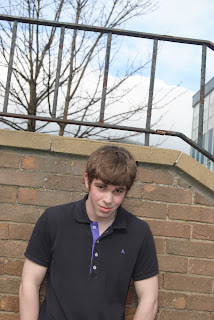
This was the second go at getting the arrogant look I was looking for I took into account the audience reasearch and therefore found a different location and told the model to look directly into the camera more. I also worked on Mise en Scene getting him to wear Red and Blue to go with my Red, White and Blue colour scheme. Many of these images turned out alright and as I was running out of time for my rought cut deadline I decided to use them but change the images for my Final Cut. Once I received feedback from my target audience the same problem came up about the model not connecting with the audience, I felt this was one of the majour thing my magazine needed therefore I decided to change my model for the Final Cut.
Eliza Jean on location 1st shots
During this shoot I really wanted to get accross the fun persona of the artist and what she stood for. Therefore I felt the location of a seaside town could be quite fun and could offer something different to the magazine. This shoot was the first one with this model so it was a bit of a test to see how she connected with the audience, I felt she came accross very well and connected to the audience. The photo to the left was especially good, it showed the fun of her personality whilst still showing her facial expression and the location. I felt this could be a perfect image for my final contents page because it was lacking the colours, brightness and fun this image was offering. As soon as I put this image onto the contents page it brightened it right up. However some of the other images didn't come out as well as I had hoped due to the windy weather conditions and I didn't zoom in enough so in many of them the framing isn't correct.
Michael and the Misfits- 1st Shoot
During this shoot I wanted to get across the arrogrance that is portaryed now in many types of music magazines, especially with male solo artists. My model was perfect to portray this look however after conducting audience research many people felt he wasn't connecting with the audience and he was making them want to buy the magazine also many people felt the location looked too much like a school and therefore it didn't look professional this lead me to scrap these photos and plan another lot using the same model but in a different location to see if that made any difference.
Eliza Jean Final Photos Studio Shoot
During this shoot I wanted to get accross a classy feeling while still going for a slight quirky atmosphere. I used a cover of Q magazine as a style model for this shoot ( Adele issue). I was aiming for a cuteness to the photos too in which the target audience could connect with. I wanted to keep the background and clothing quite simple so you could be drawn to her face and what she looks like as a artist. I wanted to get accross the simplicity of her music and of her. I wanted to market Eliza Jean as a girl next door kind of look which I think comes accross in these photos quite a lot this is why I chose these photos to be the final images for my magazine, I think they are easy to connect to and allow a bond to be made between the audience and the artist. Also the close up is to be used on the front page because her eyes draw you straight in, allowing you to spot the magazine on a shelf and instintly be attracted towards it.
Monday 23rd of April- Day before deadline day
Today is the day before deadline day and at the weekend I managed to get lots of images which I felt were perfect for the double page spread, they had amazing lighting due to the sunsetting as we were taking the photos this gave us a hazy sunshine which added lots of effects to the surrounding area. However after not having much time to upload the photos when I brough the camera in I decided to leave them til a little bit later when I would have more time. This however was a very bad decision, due to the fact that within the two hours that I had left the camera, someone else needed to use it and they wiped the whole camera . Leaving me with a decision to make, I could either try and get the photos again that night or I could work on my magazine as it was. I decided that today I would get my magazine to the best I could as it was incase I was unable to get images that were of a equal quality tonight and I decided to try and repeat the photos that night. However my model was unfortually having problems within her personal life and therefore by the time we got out to take the photos it was beging to get very dark, this caused problems with getting the correct lighting for the photos. However I still tried because some photos can look very effective in the dark.
Subscribe to:
Comments (Atom)


